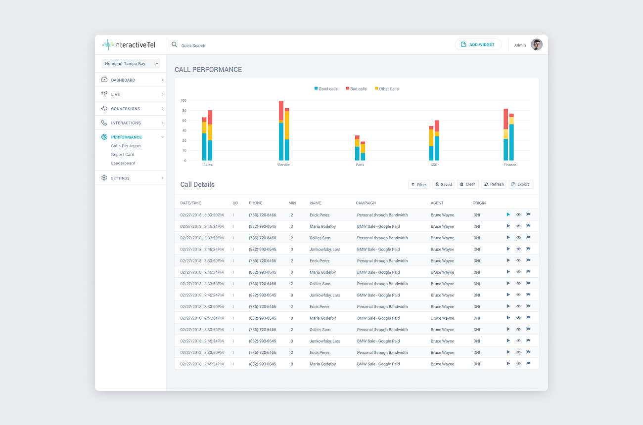


Redesigning Data-Heavy Dashboards for Clarity and Engagement: UX/UI Overhaul for InteractiveTel

InteractiveTel is a leading provider of advanced telecom solutions that offer businesses the tools to manage and optimize their communications systems. Their platform helps businesses improve efficiency and productivity through powerful analytics and reporting features that track and manage calls, usage, and performance. InteractiveTel focuses on delivering real-time insights that enable users to make data-driven decisions to enhance their communication strategies.
The Objective
InteractiveTel sought our help to redesign their third iteration of their reporting portal. They needed a skilled UX/UI designer to improve the user experience of their dashboard, which was data-heavy and complex. The goal was to make the dashboard more engaging, usable, and clear, ensuring users could easily navigate and interpret the information presented. Additionally, they wanted help communicating the platform’s functionality in a way that would be intuitive for users.
The Challenge
The existing reporting portal was dense with data and features, which made it difficult for users to quickly extract meaningful insights. The challenge was to design a dashboard that presented this data in a clear, engaging, and accessible way, especially for users who were not familiar with complex reporting tools. The redesign also needed to maintain the powerful functionality of the platform while improving usability and making it easier for users to understand and take action on the insights provided.
The Solution
- User Research & Analysis: Conducted an in-depth analysis of the product to identify pain points and user needs, ensuring the redesign addressed real challenges and simplified complex tasks.
- Engaging Dashboard Design: Created a more engaging and visually appealing dashboard by incorporating data visualization best practices and organizing information into digestible sections.
- Data Visualization: Utilized clear and interactive data visualizations, such as graphs and charts, to help users easily interpret large datasets and track key metrics at a glance.
- Streamlined User Interface: Designed an intuitive layout with enhanced navigation that made it easier for users to find and interact with relevant information without feeling overwhelmed.
- Clear Communication of Functionality: Focused on simplifying how the platform’s features were communicated to users, ensuring they could quickly understand the value of the data and how to leverage it for better decision-making.
- Interactive Elements: Introduced interactive elements like filters, drill-downs, and customizable views, allowing users to personalize their experience and focus on the metrics that matter most to them.
The result was a redesigned dashboard that presented complex data in a simple, engaging, and actionable format. Users could now easily navigate the portal, visualize their data, and understand the platform’s functionality—leading to more informed decision-making and enhanced user satisfaction.


